Arts and society in Flanders and The Netherlands
A Yearbook, 1997 - 1998
Official Anarchy
Dutch Graphic Design
Amsterdam-based designer Shigeru Watano once remarked: "Analytical and rational design principles govern dutch design". He was right. Dutch graphic design has emerged from an essentially typographic tradition and this analytical background has resulted in a clear and well organised typography - a management of the page-, that is deeply concerned with visualising the hierarchies and the construction of texts.
Departing from this base very different styles are possible: the 'classic' typographic style is a continuing, rich and living tradition in Holland, but it is another style, for which dutch graphic design has been internationaly recognised and applauded: a style that allows for a great variety of often rather complex images. A style that consists not only of a 'management of information', but that is also carrier of explicit personal interpretations and commentaries by the designer.

DEPT
Although I maintain that a typographical approach underlies most of dutch graphic design, the designers that I want to introduce here are generaly aiming at an image. Ordering information is the least one can do. On top of that the design must be evocative, emotional - and personal. Dutch graphic design is concerned with two - apparently conflicting - goals: To order information so that it becomes generaly recognisable, but at the same time to be recognisably individual: the designer, the carrier of messages, wants to assert himself aswell.
Dutch graphic design is constantly reconcyling opposites: tradition ànd experiment, typography ànd image, institutions ànd individuality, rules ànd anarchy, and ultimately: art and application, function and expression. This merging of expressionist and functionalist approaches has become a dutch design tradition in itself, from the nineteentwenties onward - from the work of expressive functionalists as Paul Schuitema and Piet Zwart and more painterly designers like Jan Sluyters and Dick Elffers.

Mevis & Van Deursen
A few years ago, an exhibition of dutch state-supported art and design was entitled: De Kracht van Heden, (The Strength of Today). For this exibition the young designers duo Mevis & Van Deursen proposed an image that is as powerfull as it is unconventional: a blurred detail of one of the icons of dutch culture, a girl's portrait by Vermeer. From the famous girl's highlighted eye, two boldly drawn arrows point outward: 'the strength / of today'.
What is meant by this poster (apart from the message that there is an exhibition) is not shown, only suggested. It can be read in verry different ways: that the strength of today's art and design rests in a glorious past, or: that tradtion is only strengthening us if we keep an eye on it, and at the same time try to forget it, or: from what we know - now - we must keep an eye on the future, or: we may have only one past, but there are many ways to interpret it and to go on.
This image also has something of a knipoog, a blink-of-the-eye, something a little 'tongue-in-cheek', as the English say. The use of a time-honoured and revered image of dutch painting to anounce an exhibition of current dutch art and design contains an ironic play with the tensions and competitions between past and present - and a sidelong warning against pretentiousnes.
I chose to analyse this poster somewhat extensively, because it comprises some of the main themes of dutch graphic design: the search for bold and unconventional images, an intricate linking of image, typography and content, the use of equivocal imagery to provoke an interpretation by the viewer, and an ironic approach to both content and context of the subject, an irony that reflects the designer's personal point of view.
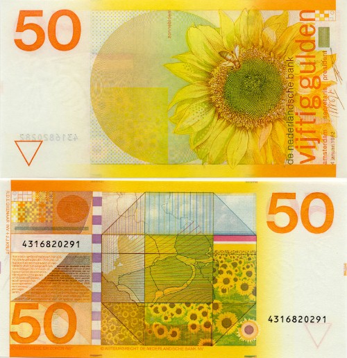
Irony and seriousness - another pair of opposing aspects that can be seen as characterizing dutch design culture. And one that can be traced even in the most prestigious printwork Holland has to offer: its money. When the Dutch State Bank, in 1982, introduced its new banknote of fifty guilders, designed by Ootje Oxenaar, visitors to Holland were frequently convinced of being cheated by their change-offices: these playfull and brightly coulored slips of paper could hardly represent serious cash!
Ootje Oxenaar
But in spite of Oxenaar's expressed appreciation for 'toy-money' and informal imagery, these notes were instantly - and internationaly - recognized as being of the highest design- and printing quality, and would therefore pose almost insurmountable problems to forgers! The unconventionality and irrationality of the image conceal an utterly rational safety-programme, that explores the boundaries of the available printing processes. It is this combination of analytical professionalism and artistic freedom, that has led to a nickname for Dutch graphic design: 'official anarchy'.
The word 'official' also points to another remarkable aspect of dutch graphic design, and one of the conditions for its flourishing: the traditional support for experimental design, by large, instutional clients. This support started in the nineteentwenties, when the dutch telecommunications company PTT employed the leading avant-gardists of those days, and it has been an important stimulant to renewal ever since.
A case in point is the reworking by Studio Gert Dumbar of the housestyle of the Dutch PTT, privatised as Royal Dutch Telecommunications Company (KPN), in the early 1990s. The rather rigidly typographical logo, designed in three precisely defined variants for the three divisions of the company, provides a severe order that stimulates a high degree of recognisability, while at the same time leaving suprisingly ample room for playfull variations on the established theme. Dumbar has created a vast range of decorative possibilities by 'deconstructing' the basic elements of the logo into simple geometric forms. The strict and simple rules that govern this - at times anarchic - play of forms and primary colours result in an abstract imagery that reminds you of the company, even when the letterhead 'KPN' is left out. Again we see a merging of strict functionality and freedom of artistic invention.

Studio Dumbar
When asked what appeals to them in dutch graphic design, foreigners will often tell us that it is precisely this curious combination of opposites: the paradoxical linkage of our traditional Calvinist-religious severity, sobriety and orderlyness to a great feeling for free expression, associative imagery en irony. Associated with this 'calvinism' is a sense of responsability, both to the process of communication as to the expression of one's own point of view.
Therefore, when designers like Anthon Beeke, Swip Stolk, Wild Plakken, or Mevis & van Deursen accept the assignment to design posters for the National Opera, museums, theatre companies or cultural manifestations, their intention is not only (or even primarily) to communicate data, but to do so in a consciously subjective, even ideosyncratic, manner. They demand that their work should be read, not as neutral information, but as a personal message and as a sign-of-the-time.
In assignments such as this, the designer can claim great freedom of interpretation and artistic autonomy, on the argument that the posters are not the primary source of information for a potential audience. The exact data will also be communicated via press, advertising and other media. The poster is assessory to this media-mix, it functions as a 'teaser', as well as acting as a metaphorical extension of the artistic processes that are work in the making of opera, theater, and exibitions - the poster not only says: 'come and see this', but also: 'we create images and stories, so you can enjoy and interpret them - come and make your own story, as we do...'

Mevis & Van Deursen
Not suprisingly, it is in graphic design for the arts and the theatre that we find the most outspoken designer-personalities: Anthon Beeke, for instance, has gained world-wide attention with his corporeal and sometimes shockingly sexual interpretations of traditional and modern plays.

Anthon Beeke
Wild Plakken have made themself a reputation by politically and socially commenting art, theatre, opera, and recently, television. For twenty years now, starting from the revolutionary 1970's this designers' collective has uncompromisingly criticised society through sometimes almost cynical, sometimes remarkably poetic images and posters. Lately they have ventured into television: WP member Rob Schröder has made leaders and short clips of tv-samples, that critically comment the medium. Being an editorially inclined designer in the first place, he is currently working for VPRO television as a program maker as well as a designer.

Wild Plakken
Another poet, be it in a more litterary vein, is Marten Jongema, who's painterly posters for the Caroussel theatre group and for the Springdance Festival visualise an atmosphere, loosly associated with the subject and its interpretors, rather than illustrating a theme.
These designers, to name just a few, represent the strong tradition of artistic autonomy in dutch graphic design. They 'accept' their clients, rather than being 'appointed' by them - a subtle but important nuance.

Marten Jongema
This artistic tradition resulted from the close relationship between artists, architects and designers of the avant-gardes at the beginning of this century, and has since been strengthened by educational models that have been derived from that same period: Dutch visual artists and designers share a common start of their education, and keep in close contact during the rest of their training at the academies of art. From this background it may come as no suprise that dutch designers - artistically trained as they are - tend to emphasise their conceptuality and compose their images on the basis of an artistic idea, rather than to be contented by craftsmanly executing a clients program.

Swip Stolk
On the other hand one shouldn't forget that there still is a strong tradition of dutch typography. But even here, it will be noticed that contemporary typographers seek more than to carefully ballance texts and grant maximum readability - they often aim at a visual poetry of type aswell. Type, as a more or less abstract repertoire of signs and forms, has been a major inspiration to such founding fathers of dutch graphic design as Piet Zwart, Paul Schuitema and designer/printer Hendrik Nicolaas Werkman and to younger masters like Sandberg or Elffers.

Dick Elffers
Since the introduction of the computer in graphic design this abstract play with type has evolved into new directions. Manipulations with text and type - sometimes beyond readability - give new energy to the tradition of dynamised typography. In Dutch design more often than not, the computer is used as a tool that facilitates typographical and image manipulation, and in the work of the more 'conservative' typographers only the professional eye will notice traces of this digital device. It is used as an extra tool that can combine fruitfully with the older techniques, as is suggested by Jaap van Triest in a cover for the design magazine 'Vormberichten', where a computer-mouse seems to impregnate an ovum-like cogwheel.
However, since the large majority of young graphic designers worldwide start off their professional carreer by aquireing an Apple MacIntosh, the language of the computer becomes more and more visible in dutch graphic design, allthough it hardly ever becomes a theme in itself, as in American, Japanese or English design.
Experimental typographers like Max Kisman, Erik van Blokland and Just van Rossum use the Mac to devise ad-hoc type and to combine amounts of type forms that would drive a phototypesetter crazy (not to mention the old lead-craftsman). They invent letterforms without fixed outlines, like the 'Beowulf' by Van Blokland and Van Rossum, or mix lettertypes to an extent that would be considered obscene by 'classic' typographers. A programmatic perversion of this kind is the 'Fudoni' by Max Kisman, one of the most prolific of digital type designers. This truely post-modern letter is, as you may have guessed, a contamination of the archetypal modern letter, the Futura, and the worthy old Bodoni. The combination of these two oposites of the typographical spectrum is all the more provocative in a country where users of serif and sans-serif type have excluded each other on ideological grounds for decades.

Max Kisman, Fudoni
Kisman has been internationally aknowleged for his experimental typedesign and for the expressive way in which he uses his letters in posters and magazines. His 'Tegentonen' posters for Paradiso music centre in Amsterdam are in the best dutch tradition of playing with type on the verge of a purely abstract composition of form. At the same time, these ideosyncratic variations of the letters of our alphabet are not just reflecting the individual aesthetics of one designer. Kisman also alludes to the fact that subcultural groups tend to identify themselves through strict formal codes that set them appart from the crowd. In his poster for the experimental type magazine Fuse, he thematised this idea in an alphabet that is almost unreadable for those who 'are not into it', Linear Konstrukt. Apart from the allusion to group identities, this typeface is playing with the post-modern notion of language as a set of signifiers that has only a temporal and unstable connection to fixed meanings. The signs could mean something, but then again, they could as well be meaningless. This post-modern fascination for linguistic structures is aptly summarized in the six code words on the poster: Information, Communication Modification, Recognition, Identification and of course in the embracing word MERGE.
As I have pointed out, dynamised typography, as a reconciliation of opposites of expressionism and functionalism, characterises contemporary dutch graphic design. Another important aspect here is the use of photography. Again, as in the abstract and decorative employment of typography, photography is often being used in ways that seem to deny its documentary origin.
In many instances photographic images are treated as abstract formal elements that together with the typeforms are constructed into a composition. Again, Piet Zwart and Paul Schuitema are the great examples for the dutch branche of this constructivist graphic design. Their use of photography has inspired generations of (not only) Dutch designers. Wild Plakken's technique of collage, for example, can be traced back to the 1920's and from this experience with photography Wild Plakken have develloped a highly personal way of expression through images. To them photos are signs, equal to words or sentences. By combining them, by orkestrating a debate between images, they communicate a story that can be read as if it were written out.
Another designer who greatly influenced the uses of photography in dutch graphic design is Gert Dumbar. Together with photographer Lex van Pieterson he popularised a combination of three-dimensional typography and 'staged photography'. In posters for the Zeebelt cultural foundation and designs for the Holland Festival Dumbar and associates interpreted the flat print surface as a 'virtual space' in which letters and images seem to freely float about. Whith this photography-based technique, the Dumbar-studio - without using computers - anticipated the possibilities for digitally reworking images and type.
Dumbar's techniques of three-dimensional typography, staged photography and his generous use of decorative elements like bent lines and dots (coined 'the meazles' by critics), have been copied to such an extent that his name has become a verb: 'to dumbar' means: 'to be shamelessly decorative'.

Studio Dumbar
Images, and the ways in which they can be used and interpreted constitute an international language, that is becomming more and more so every day. The design team of Studio Dumbar that worked on the Dutch PTT counted members from many coutries. And the originally Japanese designer Shigeru Watano has become a well respected member of the Dutch design elite...
Dutch design, these days, is made by graphic designers who originate from all over the world. 30 percent of the students at our art-academies come from outside Holland. And they are being confronted with completely new tasks. In a symposium on Dutch and Japanese graphic design, Mitsuo Katsui stressed that "we, as designers, are obliged to explore intensivly the possiblities of the new electronic media, we should engage ourselves, and master this machine, so that it won't master us..." I cannot agree more, and I'm glad to say that in Holland, as in Japan, there are young designers who are inquisitively and creatively exploring these new media.

The 'strength of today', in my view, lies in this creative influx into our well established design tradition. New ways of communicating internationally, an explosivly growing global network of electronic communication media and the exchange of the best that national traditions can contribute to each others cultures and languages, all this is part of an exiting challenge to a new generation of designers: to serve a world that still suffers from mutual misunderstanding and crummy communications.